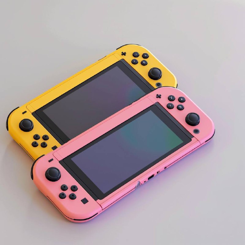
Nintendo Switch, the beloved gaming console known for its versatility and an extensive library of games, has had its fair share of praise and criticism over the years. One aspect that has consistently sparked debate among fans is its user interface (UI) design. While some enthusiasts appreciate the clean and straightforward simplicity of the current UI, others have expressed their desire for more customization options and a more visually appealing interface.
Early mockups resurface
Recently, the Nintendo Switch UI design debate has been rekindled by the emergence of apparent early mockups that date back to a few years before the console’s official release in 2017. These mockups, discovered among files on a pre-release prototype’s Nintendo Switch Nand eMMC, depict a significantly busier menu design. They showcase a plethora of icons and avatars, some of which bear a striking resemblance to those seen on the Wii U, a predecessor to the Switch.
While it is important to note that these mockups were likely placeholders and may have never been considered for the final version of the console, they have still managed to capture the attention of Nintendo enthusiasts. Icons and game logos from the Wii U and 3DS, including titles that were never intended for the Switch, are prominently featured in these early designs.
Mixed reactions from fans
The revelation of these early mockups has divided the Nintendo Switch community. Some fans have expressed enthusiasm for the alternate designs, ranging from the home menu layout to the inclusion of two folders labeled ‘Friends’ and ‘Avatars.’ Notably, these folders feature pixel art representations of iconic Nintendo characters like Donkey Kong and Yoshi, along with lesser-known figures such as Nikki, the mascot of Nintendo’s messaging applications Swapnote and Swapdoodle.
Numerous comments on social media platforms have echoed sentiments like “We were so robbed” and questioned why the final design differs so significantly from these intriguing mockups. Some gamers have found the current minimalist approach of the Switch UI to be “boring” or even “depressing,” while others lament the absence of certain features, such as the option to use a Nikki profile picture.
However, there are also staunch supporters of the Nintendo Switch’s existing UI. They argue that the final version, with its streamlined and efficient design, prioritizes ease of use and quick access to games. Some have even humorously noted that the current UI suddenly appears more appealing in comparison to the busier early mockups.
Nintendo’s design evolution
It’s worth mentioning that the dumped files not only contained early mockups of the UI but also revealed early design concepts for the Nintendo Switch before it adopted its official branding. During this period, Nintendo referred to the console as the Nintendo NX. Interestingly, these early images show that the core concept of the Switch, with its detachable Joy-Cons and versatile design, was already well-defined. The primary differences lay in the color scheme and the design of the Joy-Con sticks.
In hindsight, it becomes evident that Nintendo had a clear vision for the console long before it became the beloved Nintendo Switch we know today.
The discovery of these early mockups has reignited the ongoing debate about the Nintendo Switch’s user interface design. While some fans express admiration for the alternate designs and the inclusion of various features, others stand by the existing UI’s simplicity and efficiency.
Nintendo’s ability to continually engage its fan base and spark discussions about its products is a testament to the company’s enduring appeal in the gaming industry. Ultimately, whether fans prefer the early mockups or the current UI, it is clear that the Nintendo Switch has carved a special place in the hearts of gamers worldwide, regardless of its user interface design.

